Key Takeaways
- Garmin Connect app refresh offers a simplified design to prioritize easily digestible, relevant data.
- You can fully customize what information is displayed in the new version of Garmin Connect.
- The new version features sections like In Focus for health metrics, At a Glance for daily stats, and Sleep Coach for tips on improving sleep.
I’ve been a longtime fan of my Garmin watches because of their impressive capabilities, durability, and useful data. Garmin is constantly pushing the limits on its watches, offering new features either through hardware or software releases. But its app has always been a sore spot. Unfortunately, for a long time, it even seemed like an afterthought.
After years of users eagerly waiting, Garmin has finally delivered. Back in January at CES, the company announced a beta version of a much-anticipated refresh to the Garmin Connect app, promising significant changes. The new version offers a much simpler, modern design, with a focus on providing useful information for each individual front and center.
The best Garmin watches for every athlete
We’ve put the best Garmin watches through their paces and have found the top ones you need for any exercise routine.
How do you get the new version of Garmin Connect?
The new version of Garmin Connect initially rolled out slowly to users who had opted into Garmin’s beta program. It was seemingly random, and you could not manually opt into the new version of the app. Luckily, as of today, April 23, the revamped version of Garmin Connect is available for all Garmin users, even if they aren’t in beta.
Garmin confirmed that there will be an in-app announcement that guides users through the new look and prompts them to update their app. You’ll need to have version 5.0 to receive the prompt, though, so make sure you’ve updated your app recently if you want the new version.
What to expect from the new Garmin Connect?
First and foremost, Garmin prioritized making your data easier to see and understand. Before, it was a bit of a data dump, with everything thrown on the homepage requiring you to scroll through loads of stuff before finding what you may be looking for. Some data was only available in the More tab, making it even more confusing. It was challenging to sift through, not very user-friendly, and didn’t make me want to go into the app very often.
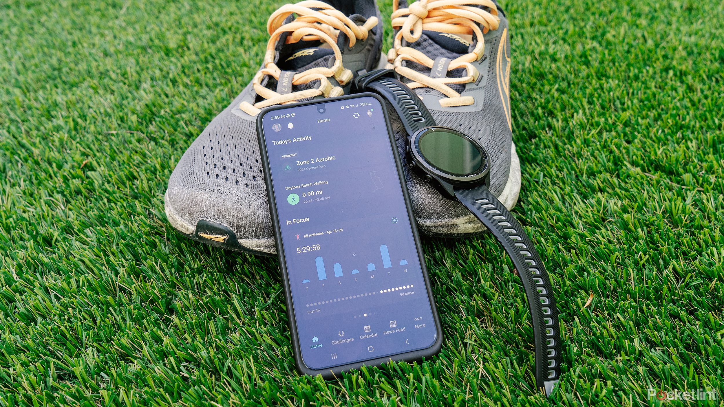
The new version, though, is much more easily digestible. It puts the activities from that day at the very top, which is the same as the old version. But from there, different sections put relevant information front and center, requiring less scrolling and searching. It’s more visually pleasing but also easier to find relevant information.
I use Garmin Connect daily: Here are the features you should use
Get the most out of your Garmin device with the Garmin Connect app.
Even better than the simplified design is the level of customization in this new version. Most of Garmin’s watches are extremely customizable. For example, most allow you to change which data feeds or training tools are displayed and in what order they appear. Of course, there are plenty of other options, depending on your particular watch, but the ability to adjust what you see first on the watch itself has always been very appreciated.
The app will function much the same way. It features customizable sections, so you can choose which data shows up right on the homepage. Of course, you can still access all of it in the More tab, but most people don’t need to see every little piece of data.
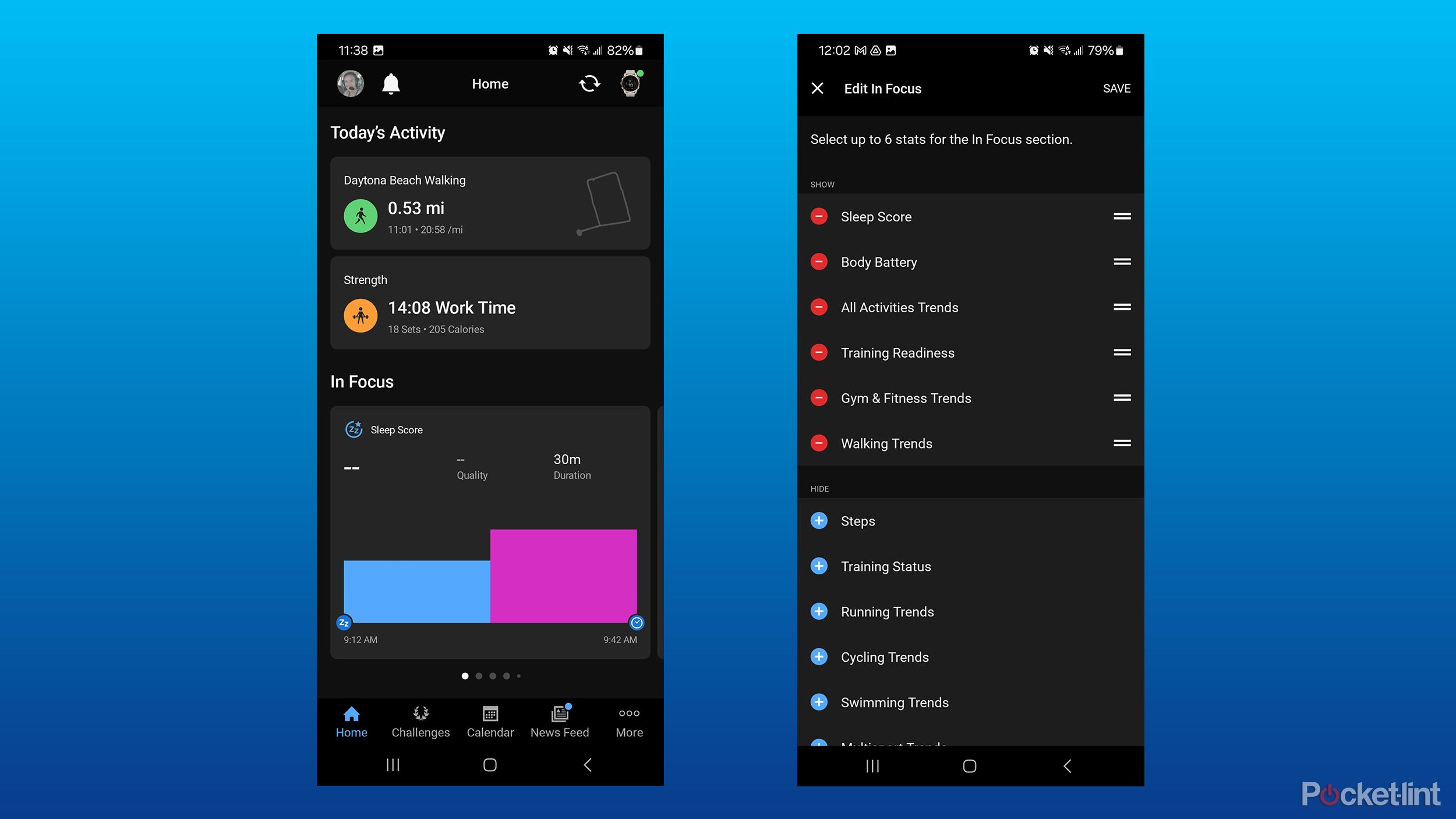
The first section is what Garmin has dubbed “In Focus.” This section provides a look at important health and fitness metrics in cards that you can swipe through. You can choose from items such as sleep score, Body Battery, training status, activity trends, and more. This is, thankfully, customizable. You can choose which categories to show there and in what order you want them. For example, you can add Cycling Trends if you are focused on cycling more so than running. Or, if you don’t wear your Garmin to sleep, you can remove the sleep score option entirely. While it gives you a snapshot of your information on the homepage, you can also tap on each card to open more detailed information about each.
Below In Focus is the Sleep Coach card. The quick summary tells you how to improve your sleep, while tapping it will show more in depth information on your sleep history, suggestions on how to improve your sleep, and what impacted your sleep. I didn’t wear my Garmin watch for a few nights, so even though I have this toggled on, it doesn’t show up on my homepage.
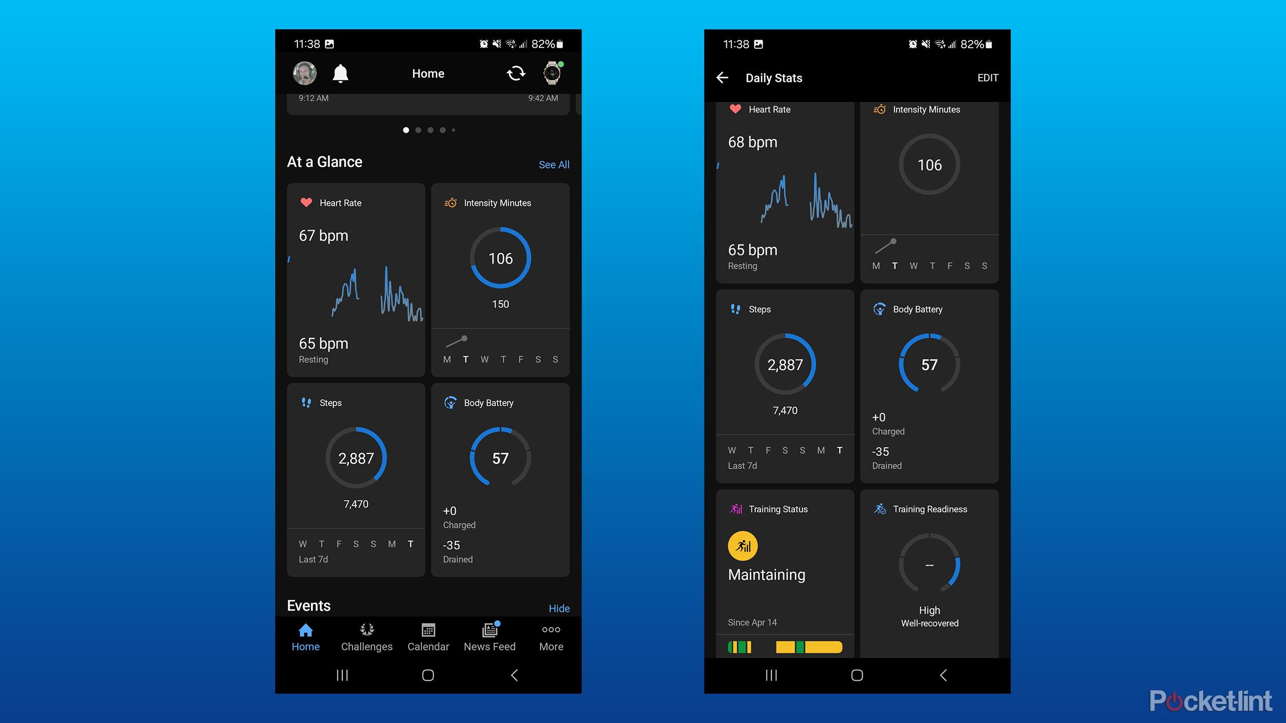
Next is the At a Glance section, which shows a wide range of daily stats in a grid of four cards. This is where you can show data like heart rate, intensity minutes, steps, hydration, HRV status, VO2 max, heat acclimation, and more. While four are displayed right on the homepage, you can also tap the See All option to view cards for all the items that you’ve selected. Beyond selecting which ones are visible, you can also change the order.
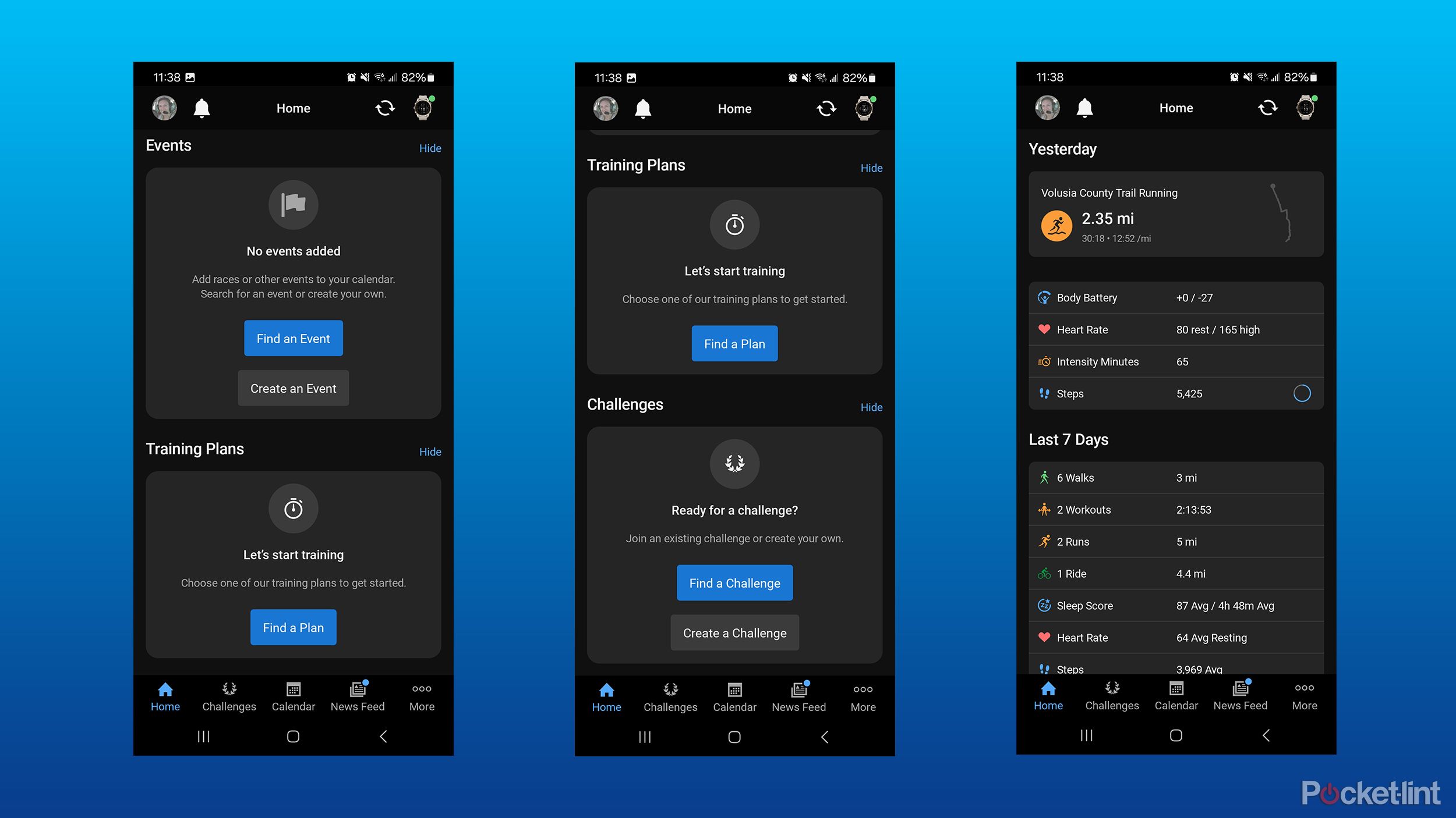
From there, you can add or remove a card for events, training plans, and challenges. If none of those are relevant to you, the app allows you to hide them. You can even quickly search for events based on your location, with links to websites and registration right in the app. You can also find training plans in the app.
If you want to see more than just the current day, you can toggle on Yesterday and Last 7 Days in the Home Settings menu. With those options turned on, you’ll see a quick snapshot of those time periods at the very bottom of the homepage. Finally, each of the sections mentioned above can be toggled on or off in the Home Settings menu. If you don’t care about the information in the In Focus section, you can simply turn it off and it won’t be taking up precious space on your screen.
Trending Products
Cooler Master MasterBox Q300L Micro-ATX Tower with Magnetic Design Dust Filter, Transparent Acrylic Side Panel…

ASUS TUF Gaming GT301 ZAKU II Edition ATX mid-Tower Compact case with Tempered Glass Side Panel, Honeycomb Front Panel…

ASUS TUF Gaming GT501 Mid-Tower Computer Case for up to EATX Motherboards with USB 3.0 Front Panel Cases GT501/GRY/WITH…

be quiet! Pure Base 500DX Black, Mid Tower ATX case, ARGB, 3 pre-installed Pure Wings 2, BGW37, tempered glass window
ASUS ROG Strix Helios GX601 White Edition RGB Mid-Tower Computer Case for ATX/EATX Motherboards with tempered glass…
